
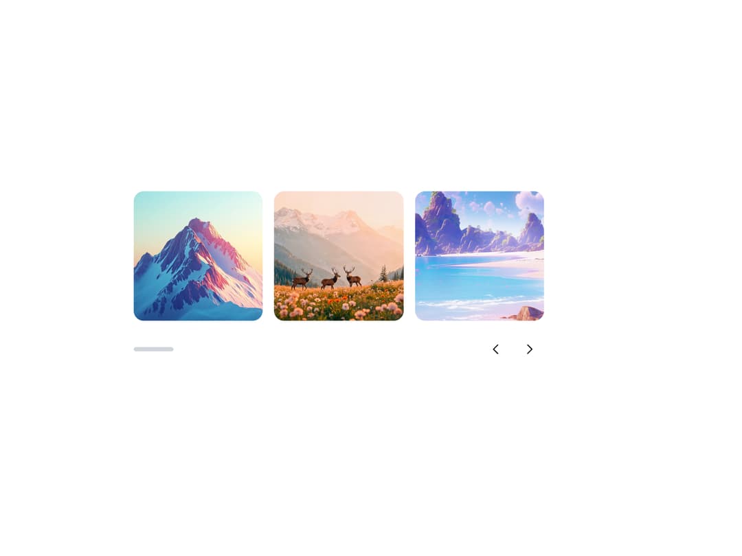
About
A draggable, swipeable image/content slider with arrows, dot pagination, thumbnails, autoplay, fade, and auto-height, for showcasing photo galleries or product shots one slide at a time.
Built with React and Tailwind. Copy the prompt and paste it into Claude Code, Cursor or Lovable: your agent adds Carousel to your project and fits it to your theme.
Code
How Carousel is used: the demo's code. The component's own source comes with a free account.
Usage.tsx
import {
  Carousel,
  CarouselContent,
  CarouselSlide,
  CarouselPrev,
  CarouselNext,
  CarouselProgress,
} from "@/components/ui/carousel";
import { Button } from "@appica/ui-react/button";
import { ChevronLeft, ChevronRight } from "@appica/icons-react";

const SLIDES = [1, 2, 3, 4, 5, 6];

export default function CarouselProgressExample() {
  return (
    <div className="w-full max-w-xl">
      <Carousel align="start">
        <CarouselContent>
          {SLIDES.map((n) => (
            <CarouselSlide key={n} className="basis-1/2 sm:basis-1/3">
              <img
                src={`https://appica.dev/carousel/slide-${n}.jpg`}
                alt={`Slide ${n}`}
                className="aspect-square w-full rounded-xl object-cover"
              />
            </CarouselSlide>
          ))}
        </CarouselContent>
        <div className="mt-5 flex items-center justify-between">
          <CarouselProgress className="w-14" />
          <div className="flex gap-2">
            <CarouselPrev
              position="none"
              render={
                <Button variant="outline" size="icon-md">
                  <ChevronLeft />
                </Button>
              }
            />
            <CarouselNext
              position="none"
              render={
                <Button variant="outline" size="icon-md">
                  <ChevronRight />
                </Button>
              }
            />
          </div>
        </div>
      </Carousel>
    </div>
  );
}
Dependencies
More by appica-dev
View all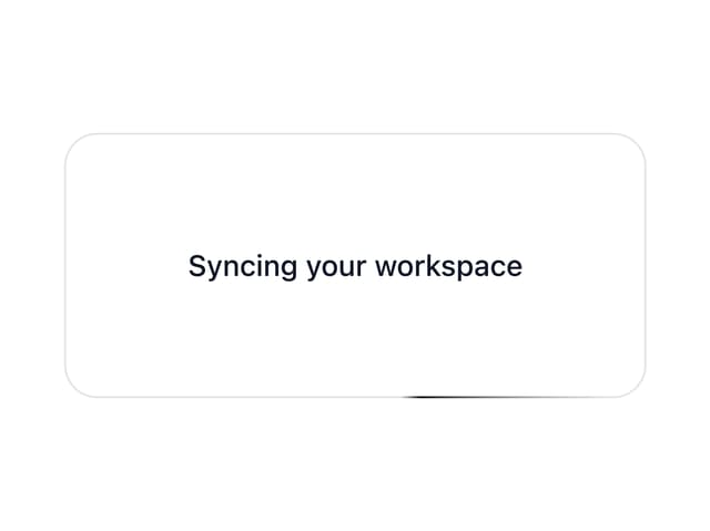
Border Beam
52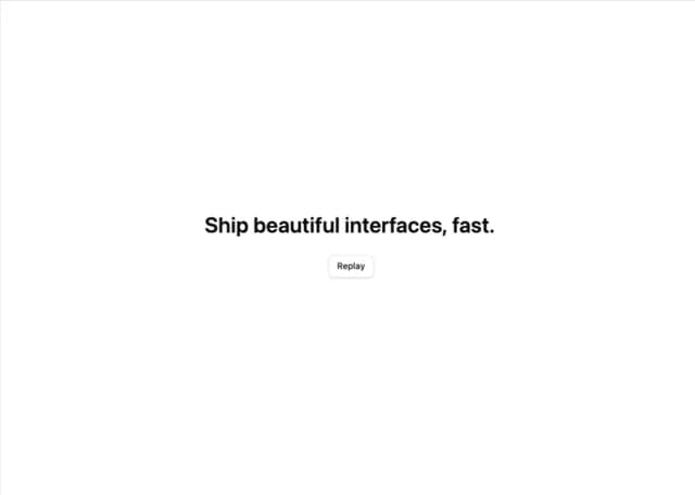
Text Animate
19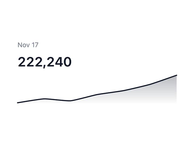
Sparkline
7
Avatar
7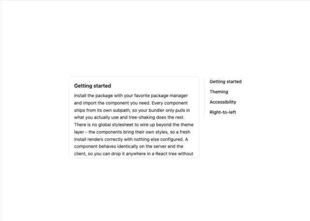
Table of Contents
6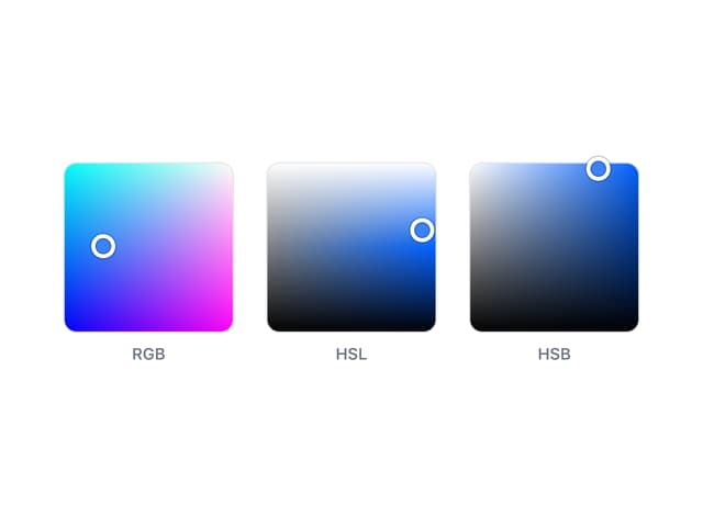
Color Area
6
Background Pattern
5
Autocomplete
2
More in Galleries
View all

Animated Gallery
1.5K
Editorial Collage Hero
458

Image Gallery
1.4K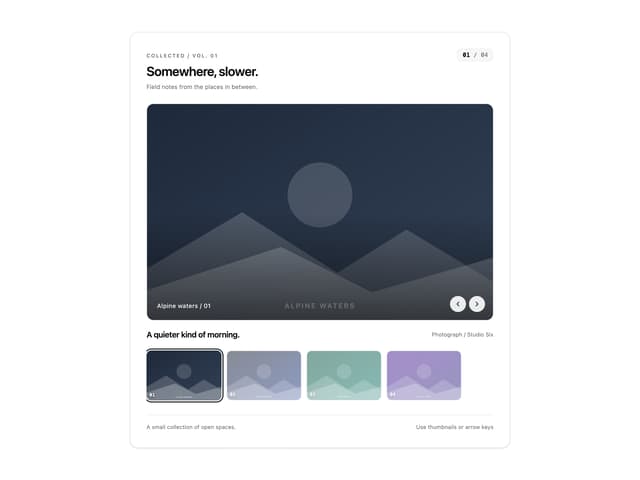
Thumbnail image viewer
64

Elastic Gallery
958
3D Parallax Unfurling Gallery
1K
Img Sphere
2.1K

Shared Element Gallery
446


