Card Components for React & Next.js
Find 422 versatile React card components built with Tailwind CSS, perfect for showcasing content elegantly in any Next.js application.
Browse components


Course Design Cards
1.1K

Statistics Card 2
270
Statistics Card 7
297
Card
56
Stats cards with links
86

Interactive Tech Stack Bento Grid with Hover Effects
151

Weather Card
56
The Item one
3

Card Studio
36

Item
10
File Card Collections
1K

Stats
40
Dashboard with Collapsible Sidebar
2.5K

Event RSVP Card
43
Approval Card
17

Contact Card
1K

Glassmorphism Profile Card
454

Testimonial
72
Empty
15

System Status Block
311
testimonial
820
Focus Frame Border
66
Bento
1.1K

Ruixen Bento Cards
448
Statistics Card 10
266
Leaderboard Card
645
Integrations Card Grid
235
Bold Stats
271
Feature Sections
352
Switch List Card
31
Funnel Chart Big
133

Bar Chart
44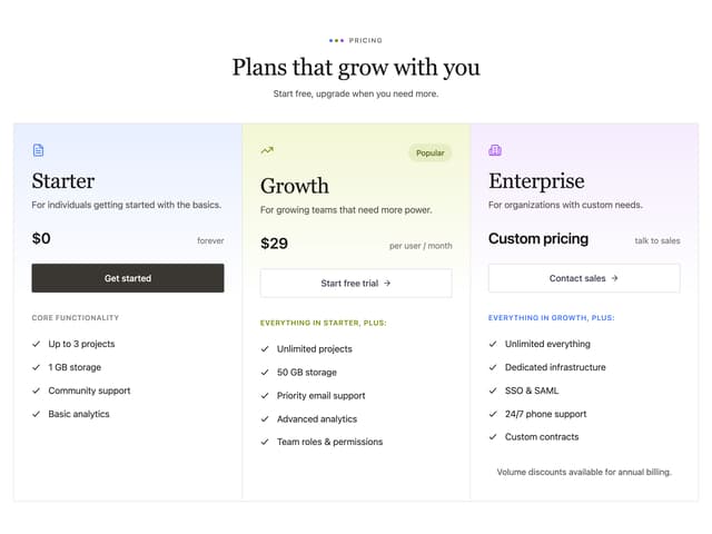
Gradient Tiers
77
Card with Ellipsis Pattern
35
Profile Dropdown
195

Checkbox
12
Checkout Form
264
Audio Upload Card
60
Features 8
3.1K
Cards
4

Shine Border
967
Streak Badge
285

Progress Metric Card
933
Card
7

Blog 8
181
Stats Section with Text
473
Card With Lines Patter
89
Blog 7
297


Keep browsing with a free account
See all 12,000+ components, 338 templates, 950 themes and 138 apps, save favourites and copy two prompts a day for free. No card needed
More card components
- Stats cards with links by Ephraim Duncan
- Card by Sean Hello
- Card Studio by Clevision
- Stats by Méschac Irung
- Testimonial by prebuiltui
- The Item one by felipemenezes098
- Empty by Cnippet
- Stats cards with links by Ephraim Duncan
- Testimonial by prebuiltui
- Card Studio by Clevision
- Stats by Méschac Irung
- Feature Sections by prebuiltui
- The Item one by felipemenezes098
- Bar Chart by Intent UI
- Empty by Cnippet
- Cards by prebuiltui
- Payment Method Card Checkbox by Cnippet
- Pricing Card by Efferd
- Modern Payment Form by Ruixen
- Animate Card Animation by Jessi
- Card Tabs by uiable
- Recent Activity Card by Oliver
- BeUI Tilt Card by Saurabh
- Card by Preet Suthar
- Stats cards with links by Ephraim Duncan
- Testimonial by prebuiltui
- Feature Sections by prebuiltui
- Stats by Méschac Irung
- Card Studio by Clevision
- Empty by Cnippet
- Cookies by prebuiltui
- Bar Chart by Intent UI
- Gradient Card by Ravi Katiyar
- Cards by LaviKatiyar
- Tabbed Feature Categories by Oliver
- Call to Action by brijr
- Border Beam by appica-dev
- Progress by Sean Hello
- The Item one by felipemenezes098
- Invite Member Card by ShadcnSpace
- Payment Card Form by felipemenezes098
- Newsletter by Ayushmaan Singh
- Data Grid Table by Sean Hello
- Login Card by Arihant jain
- Feature Problem Cards by Mohammad Shehadeh
- Skeleton Loader by animbits
- 3D Card by Kavi Katiyar
- Pie Chart by Intent UI
- Stats cards with links by Ephraim Duncan
- Testimonial by prebuiltui
- Feature Sections by prebuiltui
- Card Studio by Clevision
- Pricing Cards by prebuiltui
- Bar Chart by Intent UI
- Empty by Cnippet
- Border Beam by appica-dev
- Weekly Fitness Card by ShadcnSpace
- Login Card by Arihant jain
- Card by Ravi Katiyar
- Weather Widget by Fahad Yaseen
- Feature Section with Bento Grid by Tommy Jepsen
- Health Stat Card by ruhith
- Stats 2 by Ali Imam
- Badge Delta by Serafim
- Tilt Card by tom
- The Item one by felipemenezes098
- Achievement badge by trophyso
- Card Table by felipemenezes098
- Services Card by Ravi Katiyar
- Empty by shadcn
- Glassmorphism Folder Cards by Kedhareswer Naidu
- Achievement Card by trophyso
- Testimonial by prebuiltui
- Feature Sections by prebuiltui
- Card Studio by Clevision
- Bar Chart by Intent UI
- Pricing Cards by prebuiltui
- Empty by Cnippet
- Login Card by Arihant jain
- The Item one by felipemenezes098
- Empty by shadcn
- Pricing Card Skeleton by felipemenezes098
- Article Skeleton by felipemenezes098
- Enable 2FA Card by Ahmed Mayara
- 8bit Game Progress by OrcDev
- Framework Agnostic by Aman Shakya
- Card by LN
- Testimonial Card by Serafim
- Pricing Plan Card by Cnippet
- Gradient Bold Card by Ruixen
- Item by shadcn
- 3D tilt card by Awanish Verma
- First Place Leaderboard by nayan_radadiya6
- Glass Card by Smit Prajapati
- Border Beam by appica-dev
- Checkbox by Clevision
- Testimonial by prebuiltui
- Feature Sections by prebuiltui
- Cookies by prebuiltui
- Login Card by Arihant jain
- API Usage Meter Card by Cnippet
- Admonition by deltacomponents
- Multi Select Calendar Card by Ruixen
- Stats Card by Kavi Katiyar
- Achievement badge by trophyso
- Gradient Card Showcase by Le Thanh
- ThreeD Wall Calendar by Ruixen
- Create Account Form by Ruixen
- Animated Card Chart by badtz
- Notched Project Card by Maud Benaddi
- File Upload by Ephraim Duncan
- AI Diff by Edu Calvo
- Rating by Sean Hello
- The Item one by felipemenezes098
- Animated Geometric Card by Jatin Yadav
- Card Studio by Clevision
- Card by Preet Suthar
- Blog Section by Tommy Jepsen
- Card by Wensity Labs
- Bento Feature Grid by LN
- Testimonial by prebuiltui
- Cookies by prebuiltui
- Pricing Cards by prebuiltui
- Login Card by Arihant jain
- Item by shadcn
- Glass Shine Card by Dhileep Kumar GM
- Login Form Card by felipemenezes098
- Card Frame Table by Cnippet
- Tooltip by Origin UI
- QR Code by Abraham
- Stats by Ephraim Duncan
- Dashboard Activities by Sonu kumar
- Waitlist by Ayushmaan Singh
- Glare Cards by Daiwiik Harihar
- Animated Card by Kavi Katiyar
- Highlight Card by Berat Berkay Gökdemir
- Text Skeleton by uiable
- News letter Form by Ruixen
- Wallet Card 2 by Berat Berkay Gökdemir
- Project Card by Ravi Katiyar
- Stats Widget by Ravi Katiyar
- Leaderboard Podium by trophyso
- Gradients by Airbnb
- Radio Group by Origin UI
- Testimonial by prebuiltui
- Cards by prebuiltui
- Cookies by prebuiltui
- Login Card by Arihant jain
- Item by shadcn
- Ruixen Feature Section by Ruixen
- CreditCardForm by Rahil Vahora
- ID Card Lanyard by MAD cRuZeR
About card components
This is a large collection of 834 card components for React, the container pattern for grouping related content. You'll find product cards, pricing cards, profile and testimonial cards, stat tiles, and media cards with images or video. Styles range from flat and bordered to elevated with shadows, plus hover and 3D-tilt variants. Whether you need a react card for a grid of items or a single feature callout, there's a layout here for it.
Match the container to its content: use a media card for image-led items and a compact one for dense dashboards. Keep spacing consistent across a grid so everything lines up. Copy a card's TSX, run the shadcn CLI with its registry URL, or pull it through the Magic MCP in Cursor or Claude Code. They follow shadcn/ui conventions, use Tailwind, and drop into any Next.js project.