
About
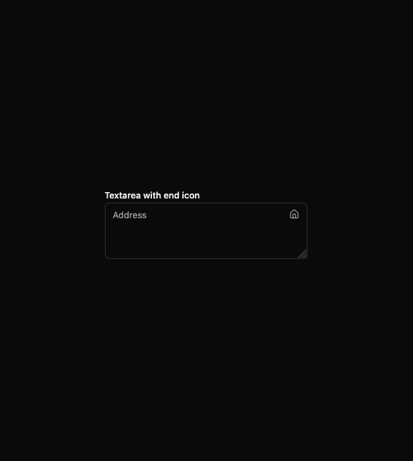
Here is Textarea component
Built with React and Tailwind. Copy the prompt and paste it into Claude Code, Cursor or Lovable: your agent adds Text Area to your project and fits it to your theme.
Code
How Text Area is used: the demo's code. The component's own source comes with a free account.
Usage.tsx
import { useId } from 'react'

import { HomeIcon } from 'lucide-react'

import { Textarea } from '@/components/ui/textarea'
import { Label } from '@/components/ui/label'

const TextareaEndIconDemo = () => {
  const id = useId()

  return (
    <div className='w-full max-w-xs space-y-2'>
      <Label htmlFor={id}>Textarea with end icon</Label>
      <div className='relative'>
        <div className='text-muted-foreground pointer-events-none absolute top-2.5 right-0 flex items-center justify-center pr-3 peer-disabled:opacity-50'>
          <HomeIcon className='size-4' />
          <span className='sr-only'>Address</span>
        </div>
        <Textarea id={id} placeholder='Address' className='peer pr-9' />
      </div>
    </div>
  )
}

export default TextareaEndIconDemo
More by Clevision
View all

Calendar
107
Card Studio
101
Collapsible
43
Button Group
38
Buttons
33
Radio Group 1
30
Combobox
27
Basic Avatar
26
More in Forms
View all

Premium Auth
524

Contact Card
1K

Book A Demo 1
73

Login 1
53

Form
137

Modern & Stunning sign in
1.6K
SignInPage
668

Split Sign In Form
46
