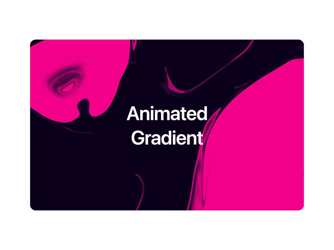
About
A full-cover WebGL animated gradient background with configurable presets, noise overlay, and swirl distortion for hero sections and cards.
Built with React and Tailwind. Copy the prompt and paste it into Claude Code, Cursor or Lovable: your agent adds Animated Gradient to your project and fits it to your theme.
Code
How Animated Gradient is used: the demo's code. The component's own source comes with a free account.
Usage.tsx
import { AnimatedGradient } from "@/components/ui/animated-gradient";

export default function AnimatedGradientDemo() {
  return (
    <div className="relative h-[420px] w-full max-w-2xl overflow-hidden rounded-xl">
      <AnimatedGradient config={{ preset: "Aurora" }} radius="12px" />
      <div className="relative z-10 flex h-full flex-col items-center justify-center px-6 text-center">
        <h1 className="text-5xl font-semibold leading-tight tracking-tight text-white">
          Animated
          <br />
          Gradient
        </h1>
      </div>
    </div>
  );
}
More by componentry
View all
Scroll Choreography
1K
Collection Surfer
819
Liquid Glass Carousel
456
Wheel Carousel
418
Circuit Board
163
Infinite Image Field
109
Magnetic Dock
106
Auth Modal
96
More in Heroes
View all

SaaS Template
2.5K

Hero
1.3K

Responsive Hero Banner
2K
Centered Hero with Image Fan
968
Editorial Collage Hero
458

Minimalist Hero Fashion
296
Glass Fold
279

Aero Hero-3
576
