
About
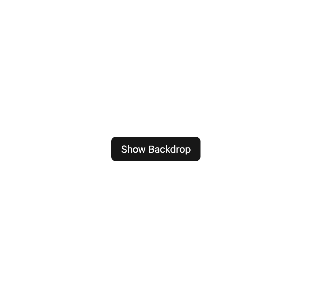
A fixed, full-screen dimmed overlay with a blur effect used behind modals, dialogs, or drawers to focus attention on the foreground content.
Built with React and Tailwind. Copy the prompt and paste it into Claude Code, Cursor or Lovable: your agent adds Backdrop to your project and fits it to your theme.
Code
How Backdrop is used: the demo's code. The component's own source comes with a free account.
Usage.tsx
"use client";

import Backdrop from "@/components/ui/backdrop";
import { useState } from "react";

export default function BackdropDemo() {
  const [open, setOpen] = useState(false);

  return (
    <div className="relative flex items-center justify-center w-full h-full min-h-[400px]">
      <button
        onClick={() => setOpen(true)}
        className="px-4 py-2 rounded-md bg-primary text-primary-foreground"
      >
        Show Backdrop
      </button>
      {open && (
        <Backdrop onClick={() => setOpen(false)}>
          <div
            onClick={(e) => e.stopPropagation()}
            className="bg-background text-foreground rounded-lg p-6 shadow-lg max-w-sm text-sm"
          >
            Click outside this box to close.
          </div>
        </Backdrop>
      )}
    </div>
  );
}
More by darshan-rajadhyaksha
View all
Switch
2
Avatar
Chip
Progress Bar
Accessible Dialog
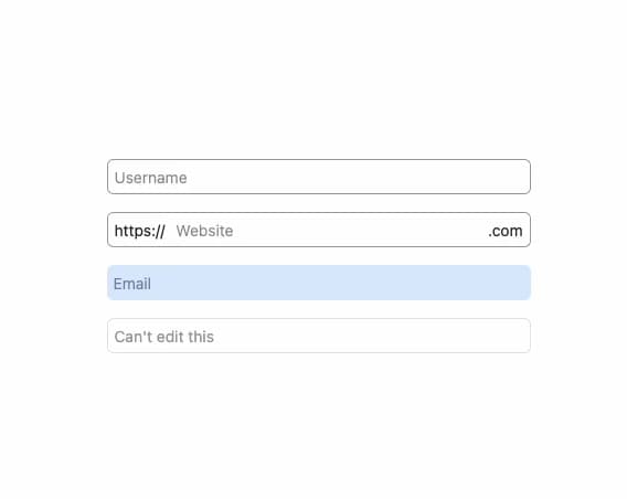
Input
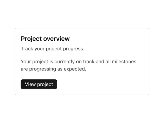
Card Content
Breadcrumbs