About
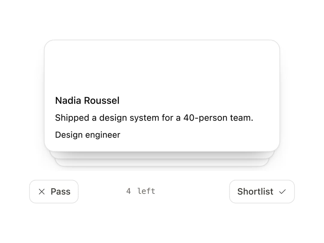
A Tinder-style swipeable card deck with drag-to-decide, keyboard controls, undo, and a generic render-prop API for any item type.
Built with React and Tailwind. Copy the prompt and paste it into Claude Code, Cursor or Lovable: your agent adds Swipe Deck to your project and fits it to your theme.
Code
How Swipe Deck is used: the demo's code. The component's own source comes with a free account.
Usage.tsx
"use client";

import { SwipeDeck } from "@/components/ui/swipe-deck";

type Lead = { id: string; name: string; role: string; note: string };

const QUEUE: Lead[] = [
  {
    id: "a",
    name: "Nadia Roussel",
    role: "Design engineer",
    note: "Shipped a design system for a 40-person team.",
  },
  {
    id: "b",
    name: "Tobias Lund",
    role: "Design engineer",
    note: "Six years of motion work, no production React.",
  },
  {
    id: "c",
    name: "Priya Menon",
    role: "Frontend",
    note: "Rewrote checkout; 12 percent fewer drop-offs.",
  },
  {
    id: "d",
    name: "Elias Kern",
    role: "Frontend",
    note: "Portfolio is three unfinished dashboards.",
  },
];

export function SwipeDeckDemo() {
  return (
    <div className="grid w-full place-items-center">
      <div className="w-full max-w-[360px]">
        <SwipeDeck
          items={QUEUE}
          itemKey={(lead) => lead.id}
          itemLabel={(lead) => `${lead.name}, ${lead.role}`}
          label="Applicant queue"
          leftLabel="Pass"
          rightLabel="Shortlist"
          emptyLabel="Queue cleared"
          height={152}
        >
          {(lead) => (
            <div className="flex h-full flex-col justify-end gap-1 p-3.5">
              <p className="text-[13px] font-medium text-ink">{lead.name}</p>
              <p className="text-[12px] leading-relaxed text-ink-2">
                {lead.note}
              </p>
              <p className="text-[11.5px] text-ink-3">{lead.role}</p>
            </div>
          )}
        </SwipeDeck>
      </div>
    </div>
  );
}

export default SwipeDeckDemo;
Dependencies
More by Özer
View all

Password Strength
1.3K
OTP Input
824
Loading Button
617
Progress Bar
594
Reorder List
318
Task Steps
284
Hold to Confirm
255
Reading Progress
174
More in Cards
View all

Course Design Cards
1.1K

Card
70
Statistics Card 2
273
Statistics Card 7
301

Interactive Tech Stack Bento Grid with Hover Effects
184
Stats cards with links
82

Weather Card
57

Card Studio
9
