
About
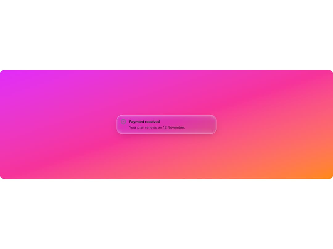
A frosted-glass callout box for banners and inline notices, with info, success, warning and destructive tints over any background image or gradient.
Built with React and Tailwind. Copy the prompt and paste it into Claude Code, Cursor or Lovable: your agent adds Glass Alert to your project and fits it to your theme.
Code
How Glass Alert is used: the demo's code. The component's own source comes with a free account.
Usage.tsx
import {
  GlassAlert,
  GlassAlertTitle,
  GlassAlertDescription,
} from "@/components/ui/glass-alert";

export default function GlassAlertDemo() {
  return (
    <div className="relative flex min-h-[420px] w-full items-center justify-center overflow-hidden rounded-2xl bg-gradient-to-br from-fuchsia-500 via-pink-500 to-orange-400 p-8">
      <GlassAlert variant="success" className="max-w-sm">
        <GlassAlertTitle>Payment received</GlassAlertTitle>
        <GlassAlertDescription>
          Your plan renews on 12 November.
        </GlassAlertDescription>
      </GlassAlert>
    </div>
  );
}
Dependencies
More by deepraj21
View all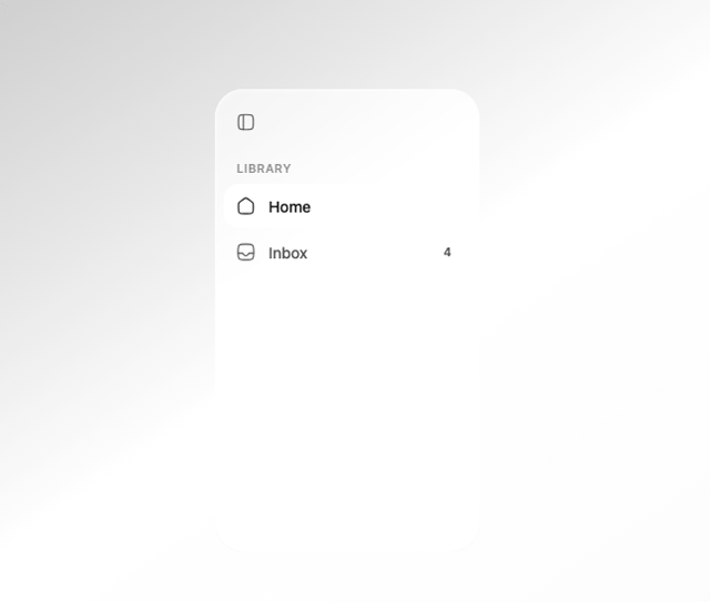
Glass Sidebar
12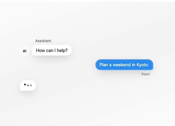
Glass Message
10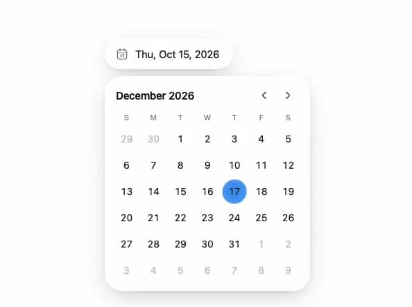
Glass Date Picker
5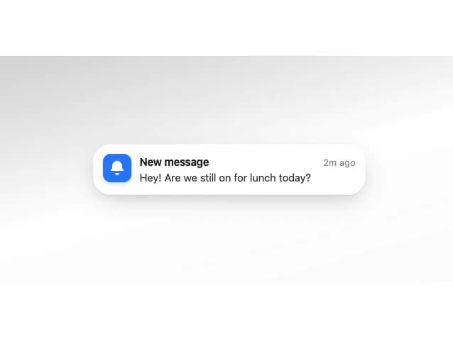
Glass Notification
4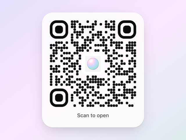
Glass QR Code
3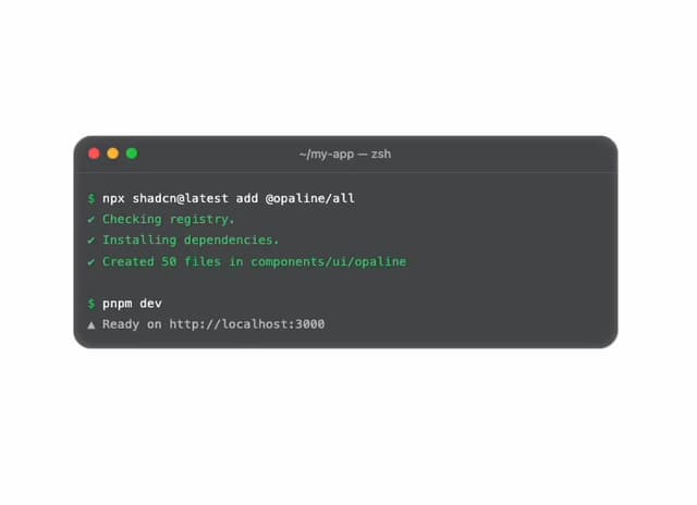
Glass Terminal
3
Glass Select
3
Glass Toolbar
2