
About
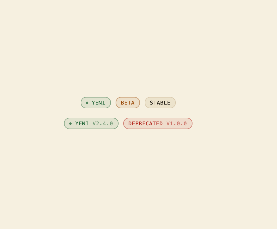
A small rounded status badge for labeling a feature or release as new, beta, stable, or deprecated, with an optional version number.
Built with React and Tailwind. Copy the prompt and paste it into Claude Code, Cursor or Lovable: your agent adds Version Badge to your project and fits it to your theme.
Code
How Version Badge is used: the demo's code. The component's own source comes with a free account.
Usage.tsx
import { VersionBadge } from "@/components/ui/version-badge";

export default function VersionBadgeDemo() {
  return (
    <div className="flex min-h-[220px] w-full flex-col items-center justify-center gap-4 bg-background p-10 text-foreground">
      <div className="flex flex-wrap items-center justify-center gap-2">
        <VersionBadge stage="new" />
        <VersionBadge stage="beta" />
        <VersionBadge stage="stable" />
      </div>
      <div className="flex flex-wrap items-center justify-center gap-2">
        <VersionBadge stage="new" version="2.4.0" />
        <VersionBadge stage="deprecated" version="1.0.0" />
      </div>
    </div>
  );
}
More by f0rextasy
View all
Newsletter Signup Card
10
Stamp Seal
7
Network Graph
7
Board Checklist
5
Empty State Card
3
Running Order Timeline
3
Invite Modal
3
Time Input
3