About
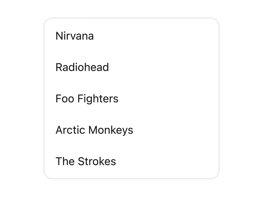
An accessible list box for presenting and selecting from a list of options, with support for sections, descriptions, multiple selection, and drag-and-drop, built on React Aria Components.
Built with React and Tailwind. Copy the prompt and paste it into Claude Code, Cursor or Lovable: your agent adds List Box to your project and fits it to your theme.
Code
How List Box is used: the demo's code. The component's own source comes with a free account.
Usage.tsx
"use client";

import { ListBox, ListBoxItem } from "@/components/ui/list-box";

export default function ListBoxDemo() {
  return (
    <div className="flex justify-center p-6">
      <ListBox aria-label="Bands" className="max-w-xs">
        <ListBoxItem>Nirvana</ListBoxItem>
        <ListBoxItem>Radiohead</ListBoxItem>
        <ListBoxItem>Foo Fighters</ListBoxItem>
        <ListBoxItem>Arctic Monkeys</ListBoxItem>
        <ListBoxItem>The Strokes</ListBoxItem>
      </ListBox>
    </div>
  );
}
Dependencies
More by Intent UI
View all

Radar Chart
223
Radial Chart
80
Bar Chart
45
Pie Chart
31
Toggle Group
27
Loader
24
Progress Bar
19
Color Slider
14