
About
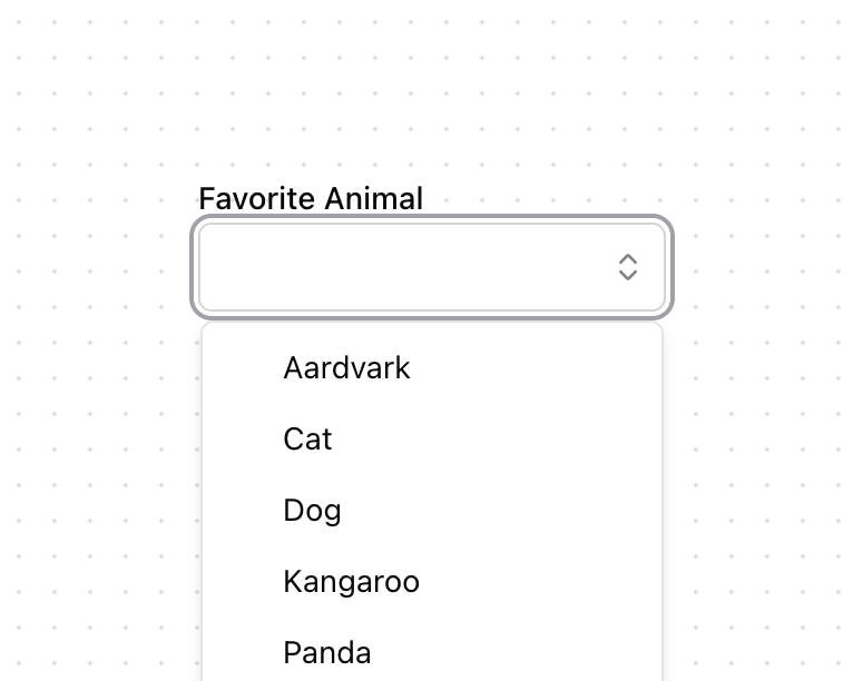
A ComboBox combines a text input with a listbox, allowing users to filter a list of options to items matching a query. A combo box can be built using the <datalist> HTML element, but this is very limited in functionality and difficult to style. ComboBox helps achieve accessible combo box and autocomplete components that can be styled as needed.
Built with React and Tailwind. Copy the prompt and paste it into Claude Code, Cursor or Lovable: your agent adds ComboBox [react-aria-components] to your project and fits it to your theme.
Code
How ComboBox [react-aria-components] is used: the demo's code. The component's own source comes with a free account.
Usage.tsx
import { ChevronsUpDown } from "lucide-react"

import { Button } from "@/components/ui/button"
import {
  Combobox,
  ComboboxInput,
  ComboboxItem,
  ComboboxListBox,
  ComboboxPopover,
} from "@/components/ui/combobox"
import { FieldGroup, Label } from "@/components/ui/field"

export function ComboboxDemo() {
  return (
    <Combobox>
      <Label>Favorite Animal</Label>
      <FieldGroup className="p-0">
        <ComboboxInput />
        <Button variant="ghost" size="icon" className="mr-1 size-6 p-1">
          <ChevronsUpDown aria-hidden="true" className="size-4 opacity-50" />
        </Button>
      </FieldGroup>
      <ComboboxPopover>
        <ComboboxListBox>
          <ComboboxItem textValue="Aardvark">Aardvark</ComboboxItem>
          <ComboboxItem textValue="Cat">Cat</ComboboxItem>
          <ComboboxItem textValue="Dog">Dog</ComboboxItem>
          <ComboboxItem textValue="Kangaroo">Kangaroo</ComboboxItem>
          <ComboboxItem textValue="Panda">Panda</ComboboxItem>
          <ComboboxItem textValue="Snake">Snake</ComboboxItem>
        </ComboboxListBox>
      </ComboboxPopover>
    </Combobox>
  )
}
Dependencies
More by James Shopland
View all
Tag Group [react-aria-components]
94
Date Range Picker [react-aria-components]
86
Grid List [react-aria-components]
71
Switch [react-aria-components]
68
Select [react-aria-components]
46
Range Calendar [react-aria-components]
38
Popover
35
Menu
34
More in Forms
View all

Premium Auth
524

Contact Card
1K

Book A Demo 1
73

Login 1
53

Form
137

Card Studio
41
SignInPage
668

Modern & Stunning sign in
1.6K
