
About
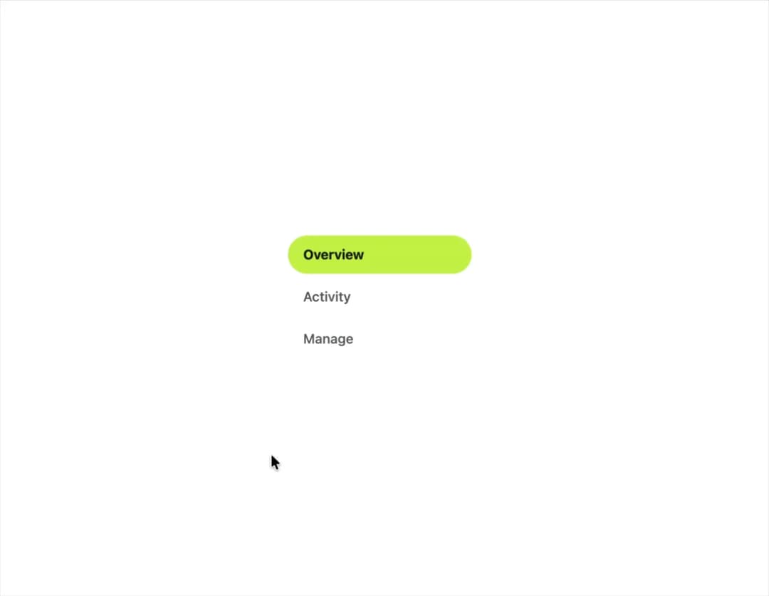
A pill-shaped single-select control for switching between a small set of options, built as an accessible radiogroup with roving arrow-key focus.
Built with React and Tailwind. Copy the prompt and paste it into Claude Code, Cursor or Lovable: your agent adds Segmented Control to your project and fits it to your theme.
Code
How Segmented Control is used: the demo's code. The component's own source comes with a free account.
Usage.tsx
"use client";

import SegmentedControl, {
  type SegmentedOption,
} from "@/components/ui/segmented-control";
import { useState } from "react";

type Section = "overview" | "activity" | "manage";

const options: SegmentedOption<Section>[] = [
  { value: "overview", label: "Overview" },
  { value: "activity", label: "Activity" },
  { value: "manage", label: "Manage" },
];

export default function SegmentedControlVerticalDemo() {
  const [section, setSection] = useState<Section>("overview");

  return (
    <div className="flex min-h-[260px] w-full items-center justify-center bg-background p-10">
      <SegmentedControl
        options={options}
        value={section}
        onValueChange={setSection}
        label="Section"
        orientation="vertical"
        className="w-48"
      />
    </div>
  );
}
More by klyv-ui
View all
Gantt Chart
63
Klyv Animated Beam
50
Shader Canvas
49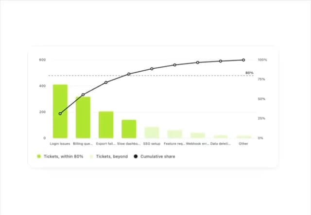
Pareto Chart
44
Gooey Loader
26
Sunburst Chart
24
Fluid Canvas
23
Morphing Text
21
More in Navigation
View all

Sidebar
286
Navbar
1

Tabs
34
Oversized 404 Numeral
57

Breadrcrumb
8

Pagination
91

Sidebar
348
Pagination
15


