
About
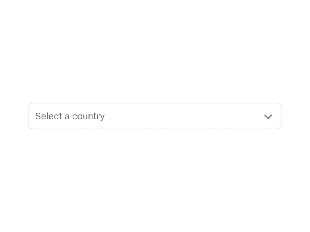
A searchable, keyboard-navigable dropdown select field for choosing a single option from a list, with support for loading, disabled, error and helper-text states.
Built with React and Tailwind. Copy the prompt and paste it into Claude Code, Cursor or Lovable: your agent adds Select to your project and fits it to your theme.
Code
How Select is used: the demo's code. The component's own source comes with a free account.
Usage.tsx
"use client";
import { Select } from "@/components/ui/select";

export default function SelectValidationStatesDemo() {
  return (
    <div className="w-full max-w-sm flex flex-col gap-6">
      <Select
        placeholder="Select a country"
        helperText="Please select a country you have been to"
      >
        <Select.Item value="US">United States</Select.Item>
        <Select.Item value="BR">Brazil</Select.Item>
        <Select.Item value="DE">Germany</Select.Item>
      </Select>

      <Select
        placeholder="Select a country"
        isValid={false}
        errorMessage="Field is required"
      >
        <Select.Item value="US">United States</Select.Item>
        <Select.Item value="BR">Brazil</Select.Item>
        <Select.Item value="DE">Germany</Select.Item>
      </Select>
    </div>
  );
}
Dependencies
More by lipa88-mk
View all
Button
Checkbox
More in Forms
View all

Premium Auth
524

Contact Card
1K

Book A Demo 1
73

Form
16

Login 1
53
Book A Demo 3
89
Hand-Drawn Checkbox
48
Login Card
6

