
About
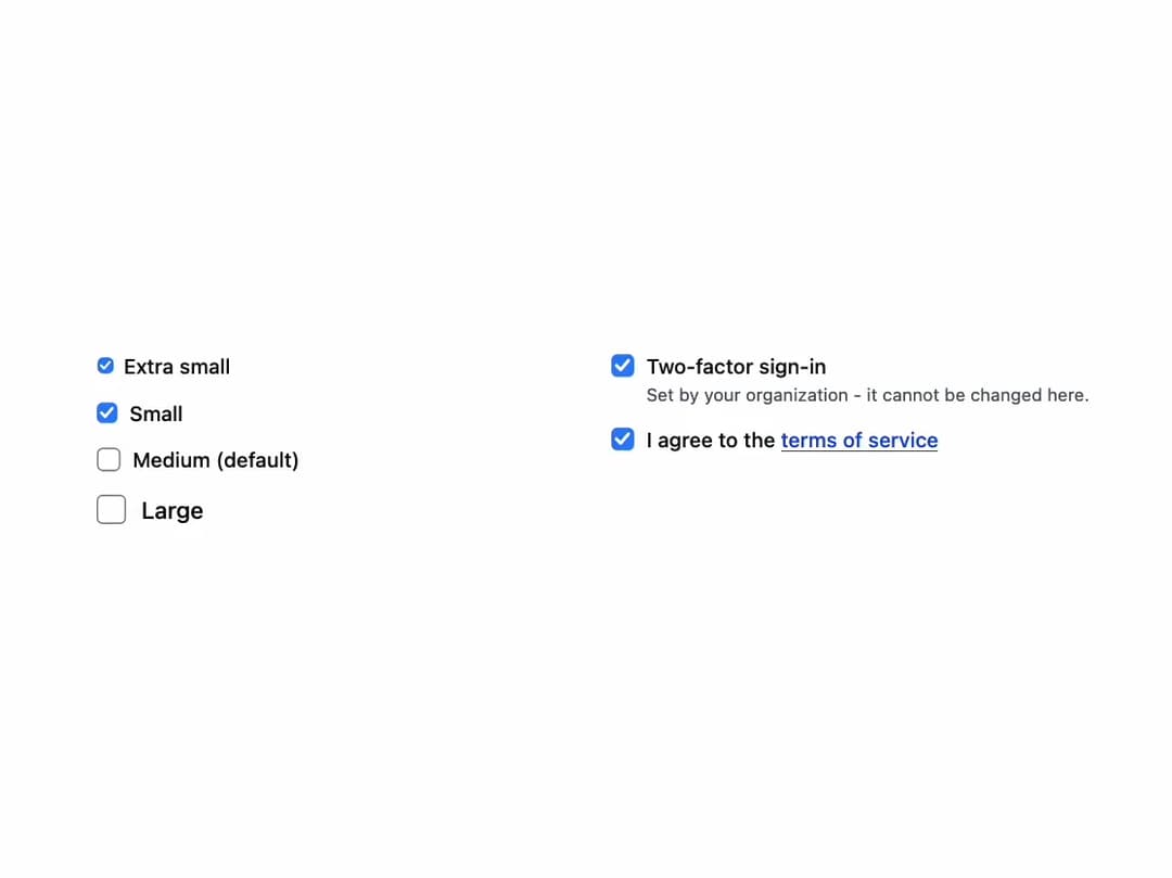
A checkbox form control with a label and optional description that works controlled or uncontrolled, and supports an indeterminate (partly checked) and a read-only state like a native checkbox.
Built with React and Tailwind. Copy the prompt and paste it into Claude Code, Cursor or Lovable: your agent adds Checkbox to your project and fits it to your theme.
Code
How Checkbox is used: the demo's code. The component's own source comes with a free account.
Usage.tsx
import Checkbox from "@/components/ui/checkbox";

export default function Sizes() {
  return (
    <div className="grid gap-6 sm:grid-cols-2">
      <div className="space-y-3">
        <Checkbox dim="xs" label="Extra small" />
        <Checkbox dim="sm" label="Small" />
        <Checkbox defaultChecked label="Medium (default)" />
        <Checkbox dim="lg" label="Large" />
      </div>
      <div className="space-y-3">
        <Checkbox
          checked
          description="Set by your organization - it cannot be changed here."
          label="Two-factor sign-in"
          name="twoFactor"
          readOnly
        />
        <Checkbox
          label={
            <>
              I agree to the{" "}
              <a
                className="text-primary-700 underline dark:text-primary-300"
                href="#terms"
              >
                terms of service
              </a>
            </>
          }
          name="terms"
        />
      </div>
    </div>
  );
}
More by robertlib
View all
Timeline
8
Spinner
3
Collapsible Content
1
Chip
1
Switch
1
Progress Indicator
1
Avatar
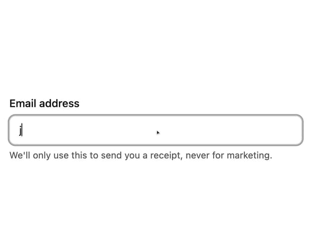
Form Description
More in Forms
View all

Premium Auth
524

Contact Card
1K

Book A Demo 1
73

Form
16

Login 1
53
Book A Demo 3
89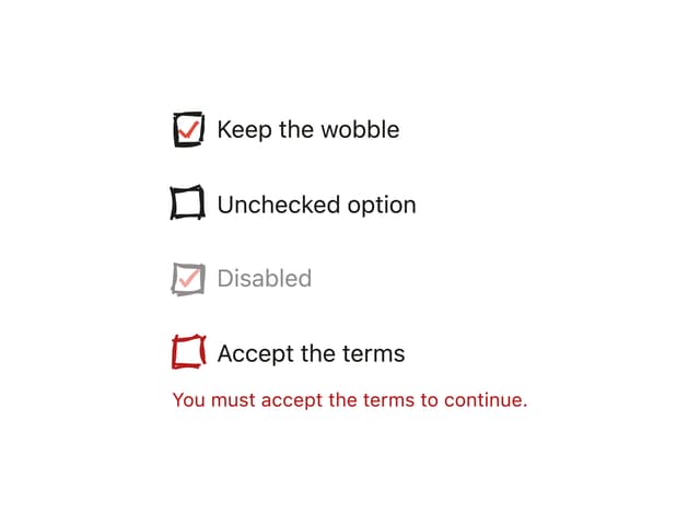
Hand-Drawn Checkbox
48
Login Card
6

