
About
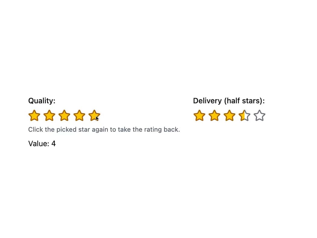
An accessible star rating slider for collecting or displaying a 1-to-5 (or custom max) score, with optional half-star precision, clearing, and form submission via a hidden input.
Built with React and Tailwind. Copy the prompt and paste it into Claude Code, Cursor or Lovable: your agent adds Star Rating to your project and fits it to your theme.
Code
How Star Rating is used: the demo's code. The component's own source comes with a free account.
Usage.tsx
"use client";

import Rating from "@/components/ui/rating";
import { useState } from "react";

export default function Basic() {
  const [quality, setQuality] = useState(4);

  return (
    <div className="grid gap-6 sm:grid-cols-2">
      <div>
        <Rating
          clearable
          description="Click the picked star again to take the rating back."
          label="Quality"
          name="quality"
          onChange={setQuality}
          value={quality}
        />
        <p className="mt-2 text-sm">
          Value: <code>{quality}</code>
        </p>
      </div>
      <Rating allowHalf defaultValue={3.5} label="Delivery (half stars)" />
    </div>
  );
}
Dependencies
More by robertlib
View all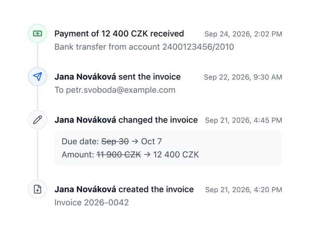
Timeline
8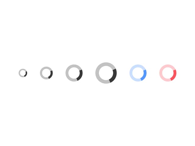
Spinner
3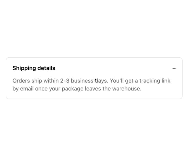
Collapsible Content
1
Chip
1
Switch
1
Progress Indicator
1
Avatar
Form Description