
About
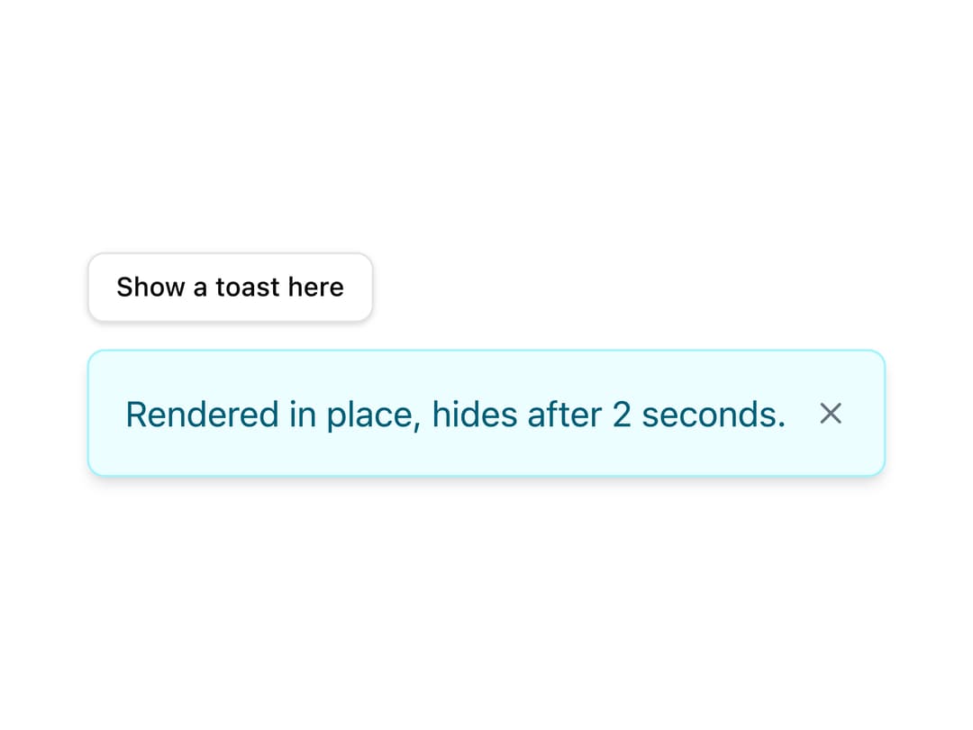
A single dismissible notification message with variant colors, an optional action button, swipe-to-dismiss and auto-hide timing, usually queued through a snackbar manager but also usable rendered standalone.
Built with React and Tailwind. Copy the prompt and paste it into Claude Code, Cursor or Lovable: your agent adds Toast to your project and fits it to your theme.
Code
How Toast is used: the demo's code. The component's own source comes with a free account.
Usage.tsx
import { useState } from "react";
import { Button } from "@/components/ui/button";
import Toast from "@/components/ui/toast";

export default function Standalone() {
  const [visible, setVisible] = useState(false);

  return (
    <div className="space-y-3">
      <Button onClick={() => setVisible(true)} size="sm" variant="outline">
        Show a toast here
      </Button>
      {visible && (
        <Toast
          duration={2000}
          message="Rendered in place, hides after 2 seconds."
          onClose={() => setVisible(false)}
          variant="info"
        />
      )}
    </div>
  );
}
Dependencies
More by robertlib
View all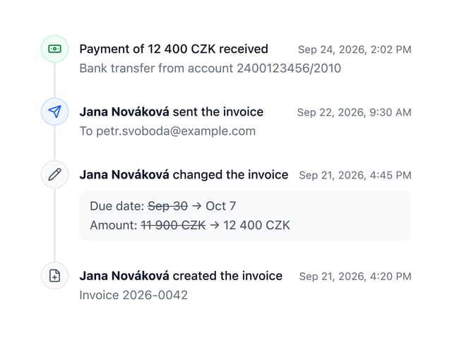
Timeline
8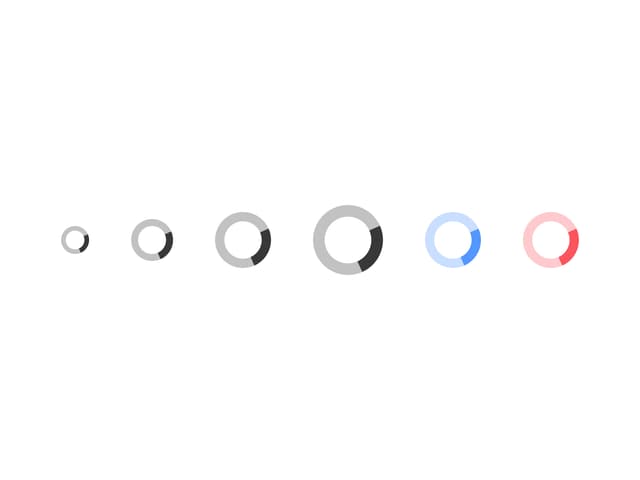
Spinner
3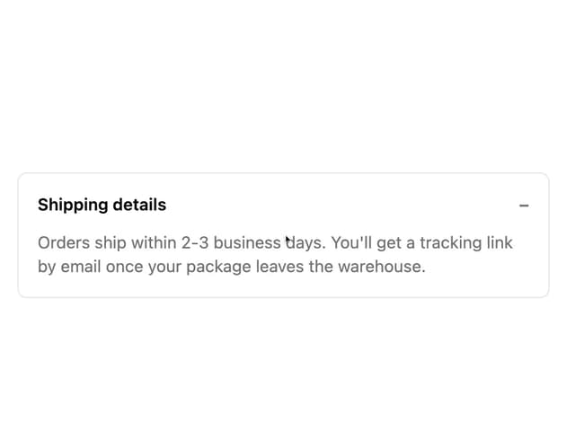
Collapsible Content
1
Chip
1
Switch
1
Progress Indicator
1
Avatar
Form Description