About
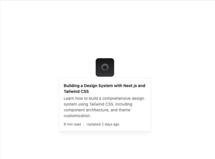
For sighted users to preview content available behind a link.
Built with React and Tailwind. Copy the prompt and paste it into Claude Code, Cursor or Lovable: your agent adds Hover Card to your project and fits it to your theme.
Code
How Hover Card is used: the demo's code. The component's own source comes with a free account.
Usage.tsx
import {
  HoverCard,
  HoverCardContent,
  HoverCardTrigger,
} from "@/components/ui/hover-card";

function HoverCardDemo() {
  return (
    <div className="max-w-md text-sm">
      <HoverCard>
        <HoverCardTrigger asChild>
          <a className="flex size-16 overflow-hidden rounded-lg" href="#">
            <img
              className="h-full w-full object-cover"
              src="https://cdn.21st.dev/assets/localized/8fe2431dd7f736ec677bd1a3216ab6d9a4e08d9a1d38d50fc96ad62e69ba738b.png"
              width={382}
              height={216}
              alt="Content image"
            />
          </a>
        </HoverCardTrigger>
        <HoverCardContent
          className="w-[320px] shadow-lg shadow-black/5"
          showArrow
        >
          <div className="space-y-3">
            <div className="space-y-1">
              <h2 className="font-semibold">
                Building a Design System with Next.js and Tailwind CSS
              </h2>
              <p className="text-sm text-muted-foreground">
                Learn how to build a comprehensive design system using Tailwind
                CSS, including component architecture, and theme customization.
              </p>
            </div>
            <div className="flex items-center gap-2 text-xs text-muted-foreground">
              <span>8 min read</span>
              <span>·</span>
              <span>Updated 2 days ago</span>
            </div>
          </div>
        </HoverCardContent>
      </HoverCard>
    </div>
  );
}

export { HoverCardDemo };

export default HoverCardDemo;
Dependencies
More by shadcn
View all

Navigation menu
782
Calendar with time pressets
513
Sidebar
348
Sonner
236
Chart
220
Icons
190
Dropdown Menu
153
Calendar with event slots
119
More in Cards
View all

Course Design Cards
1.1K

Statistics Card 7
301
Statistics Card 2
272
Stats cards with links
82

Interactive Tech Stack Bento Grid with Hover Effects
184

Card Studio
35
Card
70

Card
18
