About
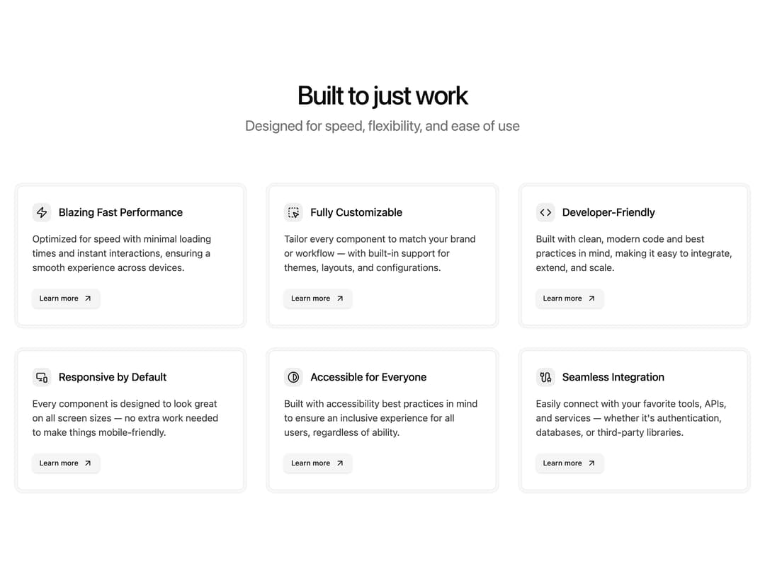
A responsive features section with a grid of cards, each showing an icon, title, description, and a "Learn more" link.
Built with React and Tailwind. Copy the prompt and paste it into Claude Code, Cursor or Lovable: your agent adds Features 11 to your project and fits it to your theme.
Code
How Features 11 is used: the demo's code. The component's own source comes with a free account.
Usage.tsx
import Features from "@/components/ui/features-11";

export default function DemoFeatures11() {
  return <Features />;
}
Dependencies
More by shadcnui-blocks
View all
Logo Cloud 15
241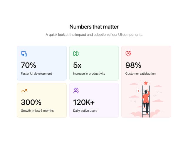
Numbers Stats Grid
225
Testimonials 13
183
Underlined Navigation Menu
92
Rich Navigation Menu
88
Integrations 02
80
Empty State with Marquee
77
Members Table Block
75
More in Features
View all

Grid Feature Cards
1.9K

Feature Sections
178

Features 8
3.1K
Features Card
213
Features 2
324
Feature with advantages
283
Feature Modern
17
Features 1
280


