
About
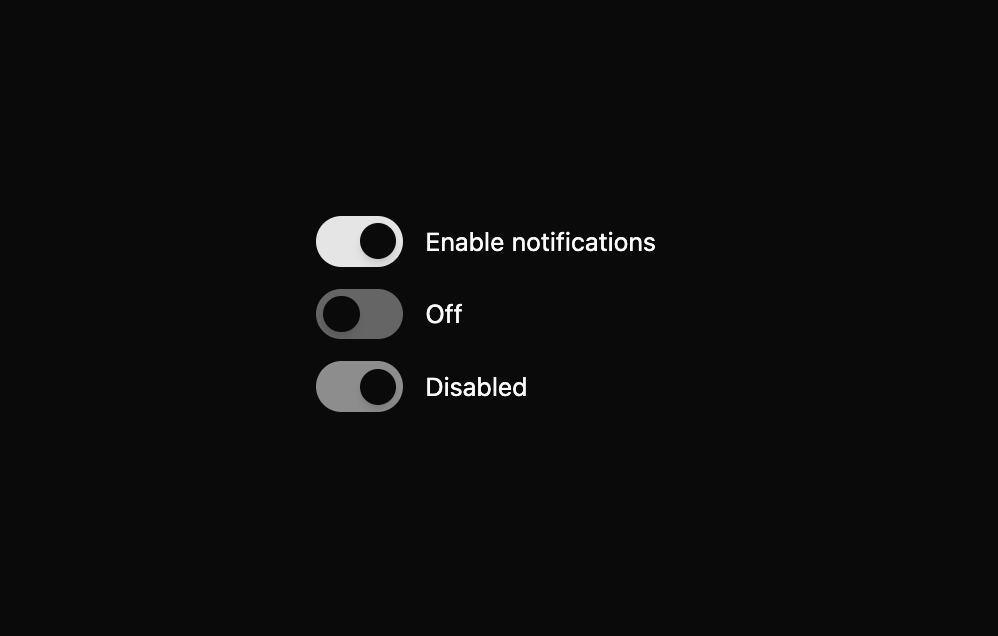
This is Switch component.
Built with React and Tailwind. Copy the prompt and paste it into Claude Code, Cursor or Lovable: your agent adds Beui Switch to your project and fits it to your theme.
Code
How Beui Switch is used: the demo's code. The component's own source comes with a free account.
Usage.tsx
"use client";

import { useState } from "react";
import { Switch } from "@/components/ui/beui-switch";

export default function SwitchPreview() {
  const [on, setOn] = useState(true);
  return (
    <div className="flex flex-col gap-3">
      <Switch checked={on} onCheckedChange={setOn} label="Enable notifications" />
      <Switch checked={false} onCheckedChange={() => {}} label="Off" />
      <Switch checked disabled onCheckedChange={() => {}} label="Disabled" />
    </div>
  );
}
Dependencies
More by Saurabh
View all
BeUI Tilt Card
374
BeUI Expandable Tabs
351
BeUI File Upload
296
BeUI Bouncy Accordion
206
Animated Sidebar
202
BeUI Create Menu
199
BeUI Expanable Action Bar
194
Loader
188
More in Forms
View all

Premium Auth
524

Contact Card
1K

Book A Demo 1
73

Login 1
53

Form
137

Card Studio
41
SignInPage
667

Modern & Stunning sign in
1.6K
