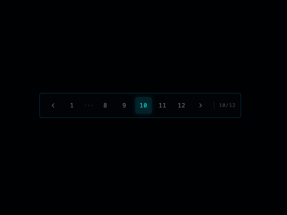
About
A compact, Tron-inspired pagination control with previous/next arrows, truncated page numbers with ellipses, sibling range, and a page-count indicator.
Built with React and Tailwind. Copy the prompt and paste it into Claude Code, Cursor or Lovable: your agent adds Pagination to your project and fits it to your theme.
Code
How Pagination is used: the demo's code. The component's own source comes with a free account.
Usage.tsx
"use client";

import * as React from "react";
import { Pagination } from "@/components/ui/thegridcn-pagination";

export default function PaginationDemo() {
  const [page, setPage] = React.useState(4);

  return (
    <div className="flex min-h-64 w-full items-center justify-center bg-background p-10">
      <Pagination currentPage={page} totalPages={12} onPageChange={setPage} />
    </div>
  );
}
More by thegridcn
View all
Energy Meter
79
Waveform
56
Data Stream
54
CTA Banner
23
Video Player
23
Terminal
16
3D Tron Grid Background
8
Testimonial Card
5
More in Navigation
View all

Sidebar
286
Navbar
1

Tabs
34
Oversized 404 Numeral
57

Breadrcrumb
8

Pagination
91

Sidebar
348
Pagination
15


