
About
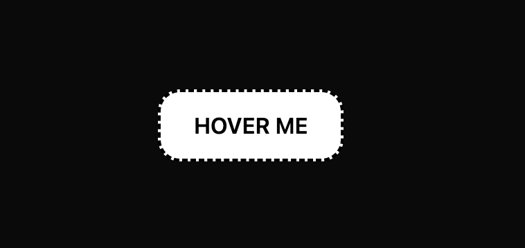
This React component renders a button with a dotted border, white background, and black text. On hover, it subtly translates and adds a shadow; on active click, it reverts to its original state. The styling uses Tailwind CSS for rapid UI development.
Built with React and Tailwind. Copy the prompt and paste it into Claude Code, Cursor or Lovable: your agent adds Button with Hover and Active Effects to your project and fits it to your theme.
Code
How Button with Hover and Active Effects is used: the demo's code. The component's own source comes with a free account.
Usage.tsx
import DottedButton from "@/components/ui/button-with-hover-and-active-effects";

export default function DemoOne() {
  return <DottedButton />;
}
More by Sonu kumar
View all
Dashboard with Collapsible Sidebar
2.5K
Modern Hero
1.4K
Text Parallax Content (scroll)
1.2K
About Us section
1.2K
Modern Animated Hero Section
1.2K
Animated Hero Section
693
Cuisine Selector Chips
591
Bounce card features
579
More in Buttons
View all

Button
1
Texture Button
97

Eclipse Button
39

App Store Button
458

HeroUI Button Group
2
Button
4

Button
65
Button
68


