
About
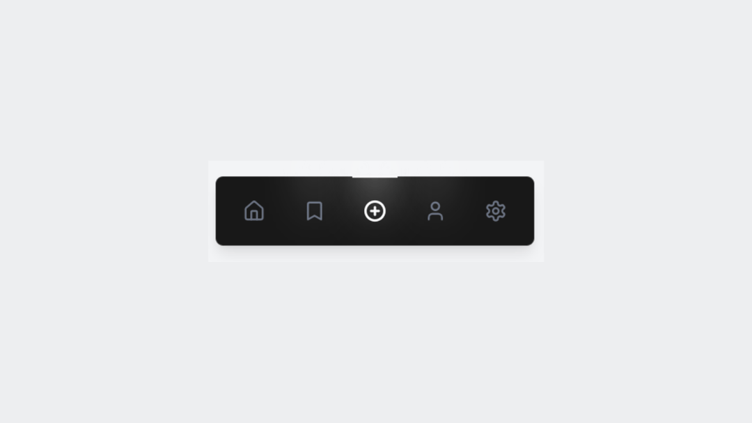
A modern and minimal bottom navigation bar with smooth spotlight effects on hover. Simple icons and subtle motion give it a polished feel that's perfect for clean UI designs.
Built with React and Tailwind. Copy the prompt and paste it into Claude Code, Cursor or Lovable: your agent adds Spotlight Button to your project and fits it to your theme.
Code
How Spotlight Button is used: the demo's code. The component's own source comes with a free account.
Usage.tsx
// This is file with demos of your component
// Each export is one usecase for your component

import { Component } from "@/components/ui/spotlight-button";

const DemoOne = () => {
  return <Component />;
};

export { DemoOne };
Dependencies
More by waiz
View all

SaaS Template
2.5K
image auto slider
1.8K
Silk-Background-animation
935
Portfolio Hero
905
Gradient bars Background
594
Glow Button
396
Gradient Bar hero section
345
Retro Grid
269
More in Buttons
View all

Button
5
Texture Button
97

Button Group


Eclipse Button
39
Button
4

HeroUI Button Group

Base Button
4

App Store Button
458

