

About
An accessible modal dialog with header, body and footer slots for forms, confirmations and focused tasks. Animated open and close with focus trapping, built on Base UI.
Built with React and Tailwind. Copy the prompt and paste it into Claude Code, Cursor or Lovable: your agent adds Dialog to your project and fits it to your theme.
Code
How Dialog is used: the demo's code. The component's own source comes with a free account.
Usage.tsx
"use client";

import * as React from "react";
import { Dialog, DialogBody, DialogClose, DialogContent, DialogDescription, DialogFooter, DialogHeader, DialogTitle, DialogTrigger } from "@/components/ui/dialog";

import { clsx, type ClassValue } from "clsx";
import { twMerge } from "tailwind-merge";

function cn(...inputs: ClassValue[]) {
  return twMerge(clsx(inputs));
}

const Button = React.forwardRef<
  HTMLButtonElement,
  React.ButtonHTMLAttributes<HTMLButtonElement> & {
    variant?: "primary" | "secondary" | "ghost";
    leftIcon?: React.ReactNode;
  }
>(function Button({ variant = "primary", leftIcon, className, children, ...props }, ref) {
  return (
    <button
      ref={ref}
      type="button"
      className={cn(
        "inline-flex h-9 items-center justify-center gap-2 rounded-[10px] px-4 text-sm font-medium outline-none transition-colors focus-visible:ring-2 focus-visible:ring-[var(--ring)] [&_svg]:size-4",
        variant === "primary" && "bg-[var(--primary)] text-[var(--primary-foreground)] hover:opacity-90",
        variant === "secondary" && "border border-[var(--border)] bg-[var(--background)] text-[var(--foreground)] hover:bg-[var(--muted)]",
        variant === "ghost" && "text-[var(--foreground)] hover:bg-[var(--muted)]",
        className,
      )}
      {...props}
    >
      {leftIcon}
      {children}
    </button>
  );
});

const Input = React.forwardRef<
  HTMLInputElement,
  React.InputHTMLAttributes<HTMLInputElement> & { leftIcon?: React.ReactNode }
>(function Input({ leftIcon, className, ...props }, ref) {
  return (
    <div className="relative flex items-center">
      {leftIcon && (
        <span className="pointer-events-none absolute left-3 text-[var(--muted-foreground)] [&_svg]:size-4">
          {leftIcon}
        </span>
      )}
      <input
        ref={ref}
        className={cn(
          "h-9 w-full rounded-[10px] border border-[var(--border)] bg-[var(--background)] px-3 text-sm text-[var(--foreground)] outline-none placeholder:text-[var(--muted-foreground)] focus-visible:ring-2 focus-visible:ring-[var(--ring)]",
          leftIcon && "pl-9",
          className,
        )}
        {...props}
      />
    </div>
  );
});

function Label({ className, ...props }: React.LabelHTMLAttributes<HTMLLabelElement>) {
  return <label className={cn("text-sm font-medium text-[var(--foreground)]", className)} {...props} />;
}

const primitivePreviewCardSurfaceFrameClass = cn(
  "relative isolate overflow-hidden rounded-2xl",
  "border",
);

const primitivePreviewCardSurfaceLightClass = cn(
  "border-black/[0.08] bg-[#f4f4f5]",
  "[box-shadow:0_1px_2px_rgba(0,0,0,.06),0_8px_24px_-12px_rgba(0,0,0,.08)]",
);

const primitivePreviewCardSurfaceClass = cn(
  primitivePreviewCardSurfaceFrameClass,
  primitivePreviewCardSurfaceLightClass,
  // Full static `dark:bg-[#0a0a0b]` kept for Tailwind content scan - same as
  // PRIMITIVE_PREVIEW_CANVAS_DARK_BG / PRIMITIVE_PREVIEW_CANVAS_DARK.
  "dark:border-white/[0.06] dark:bg-[#0a0a0b] dark:[box-shadow:0_1px_2px_rgba(0,0,0,.4),0_8px_24px_-12px_rgba(0,0,0,.6)]",
);

const wensityCardSurfaceClass = primitivePreviewCardSurfaceClass;

function DemoFrame({
  title,
  subtitle,
  children,
  className,
}: {
  title?: string;
  subtitle?: string;
  children: React.ReactNode;
  className?: string;
}) {
  return (
    <div className={cn(wensityCardSurfaceClass, "w-full max-w-md p-5", className)}>
      {title ? (
        <div className="mb-4 border-b border-[var(--border)] pb-3">
          <p className="text-sm font-semibold tracking-[-0.015em] text-[var(--foreground)]">
            {title}
          </p>
          {subtitle ? (
            <p className="mt-1 text-[12px] text-[var(--muted-foreground)]">{subtitle}</p>
          ) : null}
        </div>
      ) : null}
      {children}
      <p className="mt-4 text-center text-[11px] text-[var(--muted-foreground)]">
        Opens as a full-viewport overlay
      </p>
    </div>
  );
}

export function DialogPreview() {
  return (
    <DemoFrame title="Edit workspace" subtitle="Centered modal with ease-out scale entrance.">
      <Dialog defaultOpen>
        <DialogTrigger asChild>
          <Button variant="secondary">Open dialog</Button>
        </DialogTrigger>
        <DialogContent variant="default">
          <DialogHeader>
            <DialogTitle>Rename workspace</DialogTitle>
            <DialogDescription>
              This name appears on invoices and shared links.
            </DialogDescription>
          </DialogHeader>
          <DialogBody className="space-y-3">
            <div className="space-y-1.5">
              <Label htmlFor="dialog-preview-name">Workspace name</Label>
              <Input id="dialog-preview-name" defaultValue="Wensity Studio" />
            </div>
          </DialogBody>
          <DialogFooter>
            <DialogClose asChild>
              <Button variant="ghost">Cancel</Button>
            </DialogClose>
            <DialogClose asChild>
              <Button>Save changes</Button>
            </DialogClose>
          </DialogFooter>
        </DialogContent>
      </Dialog>
    </DemoFrame>
  );
}

export default function Demo() {
  return <DialogPreview />;
}
Dependencies
More by Wensity Labs
View all

Sidebar
286
Calendar
189
Button
87
Color Picker
71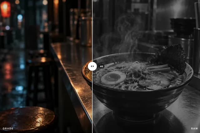
Image Comparison Slider
65
AI Prompt Input
54
Text Morphing
42
Navigation Menu
36
More in Forms
View all

Premium Auth
524

Contact Card
1K

Book A Demo 1
73

Login 1
53

Form
137

Card Studio
41
SignInPage
668

Modern & Stunning sign in
1.6K
