
About
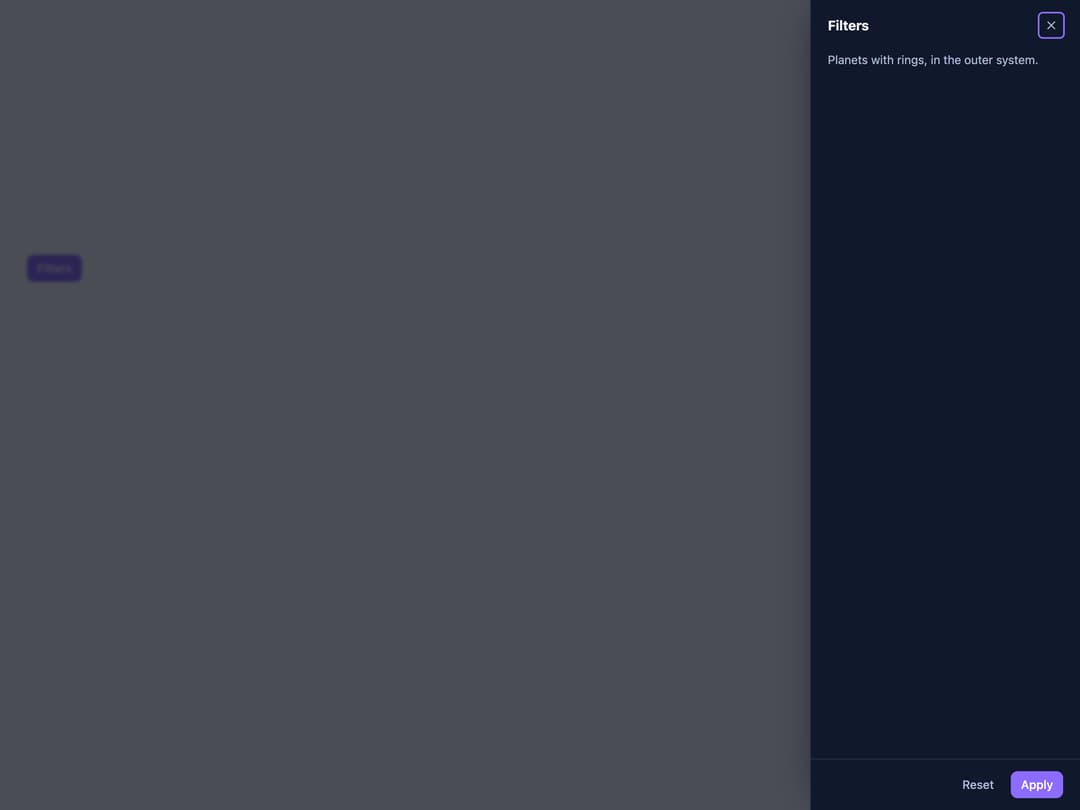
A panel built on the native dialog element that slides in from an edge of the screen, for navigation, filters or an edit form, with modal and non-modal modes.
Built with React and Tailwind. Copy the prompt and paste it into Claude Code, Cursor or Lovable: your agent adds Drawer to your project and fits it to your theme.
Code
How Drawer is used: the demo's code. The component's own source comes with a free account.
Usage.tsx
"use client";

import Drawer from "@/components/ui/drawer";

export default function DrawerInlineDemo() {
  return (
    <div className="flex min-h-[420px] w-full items-start justify-center p-8">
      <Drawer
        inline
        side="start"
        heading="Mission log"
        style={{ ["--sb-drawer-size" as any]: "16rem" }}
      >
        Day 12. The rings of X-9 are in view.
      </Drawer>
    </div>
  );
}
More by zweiundeins
View all
Theme Switch
11
Busy
9
ECharts
1
Count Up
1
Sparkline

Starfield
Odometer
Meter