
About
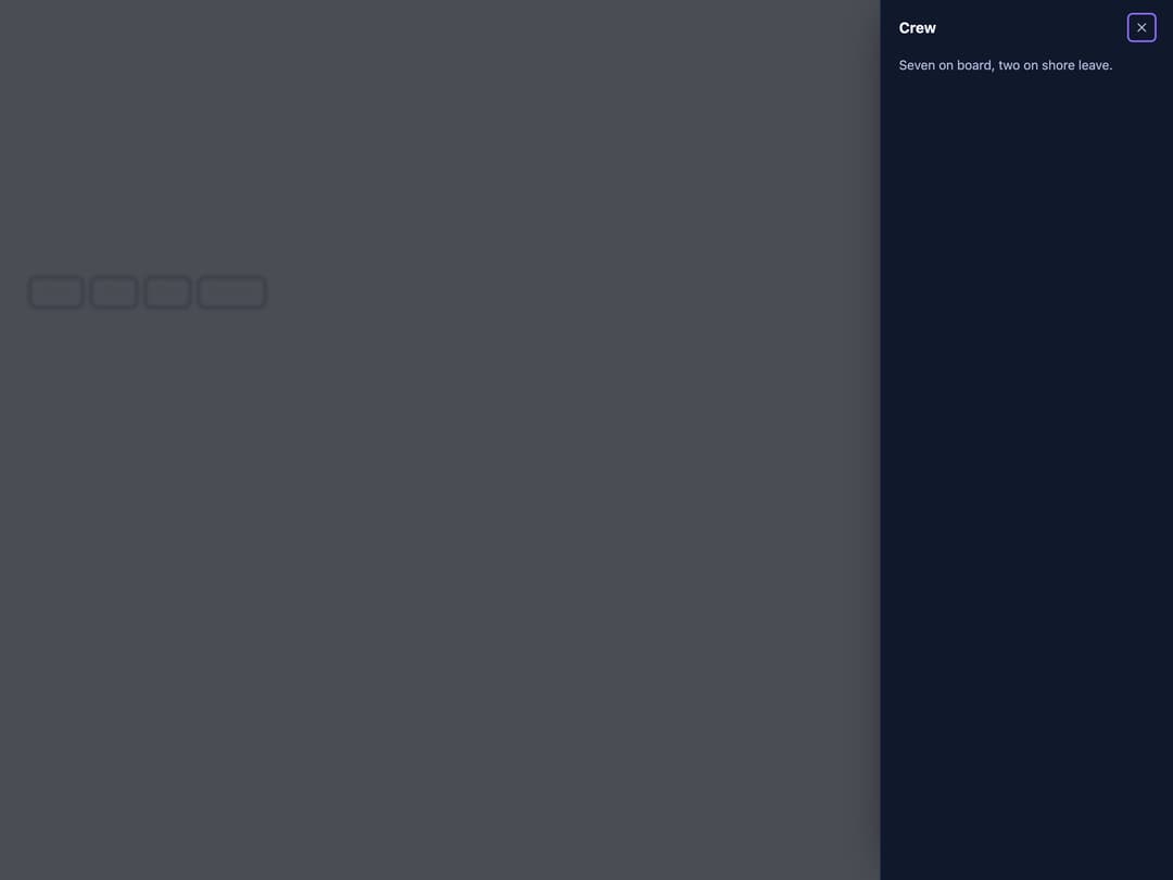
A panel built on the native dialog element that slides in from an edge of the screen, for navigation, filters or an edit form, with modal and non-modal modes.
Built with React and Tailwind. Copy the prompt and paste it into Claude Code, Cursor or Lovable: your agent adds Drawer to your project and fits it to your theme.
Code
How Drawer is used: the demo's code. The component's own source comes with a free account.
Usage.tsx
"use client";

import * as React from "react";
import Drawer, { DrawerHandle } from "@/components/ui/drawer";

export default function DrawerSidesDemo() {
  const startRef = React.useRef<DrawerHandle>(null);
  const endRef = React.useRef<DrawerHandle>(null);
  const topRef = React.useRef<DrawerHandle>(null);
  const bottomRef = React.useRef<DrawerHandle>(null);

  const btn =
    "rounded-md border border-[#283552] px-3 py-1.5 text-sm font-medium text-[#F3F4FA] hover:bg-white/5";

  return (
    <div className="flex min-h-[420px] w-full flex-wrap items-start gap-2 p-8">
      <button
        type="button"
        onClick={() => startRef.current?.show()}
        className={btn}
      >
        Start
      </button>
      <button
        type="button"
        onClick={() => endRef.current?.show()}
        className={btn}
      >
        End
      </button>
      <button
        type="button"
        onClick={() => topRef.current?.show()}
        className={btn}
      >
        Top
      </button>
      <button
        type="button"
        onClick={() => bottomRef.current?.show()}
        className={btn}
      >
        Bottom
      </button>

      <Drawer ref={startRef} side="start" heading="Navigation">
        <nav className="grid gap-2">
          <a href="#">Bridge</a>
          <a href="#">Engine room</a>
          <a href="#">Cargo bay</a>
        </nav>
      </Drawer>
      <Drawer ref={endRef} side="end" heading="Crew">
        Seven on board, two on shore leave.
      </Drawer>
      <Drawer
        ref={topRef}
        side="top"
        heading="Alerts"
        style={{ ["--sb-drawer-size" as any]: "10rem" }}
      >
        No alerts in this sector.
      </Drawer>
      <Drawer
        ref={bottomRef}
        side="bottom"
        heading="Cargo"
        style={{ ["--sb-drawer-size" as any]: "14rem" }}
        footer={
          <button
            type="button"
            data-sb-close
            className="rounded-md bg-[#8C6BFF] px-3 py-1.5 text-sm font-medium text-white"
          >
            Done
          </button>
        }
      >
        Twelve crates of ice, one of spare parts.
      </Drawer>
    </div>
  );
}
More by zweiundeins
View all
Theme Switch
11
Busy
9
ECharts
1
Count Up
1
Sparkline

Starfield
Odometer
Meter
More in Navigation
View all

Sidebar
286
Navbar
1

Tabs
15

Sidebar
348
Numberless Pagination with Text
11
Pagination
108
Oversized 404 Numeral
57

Breadrcrumb
4

