
About
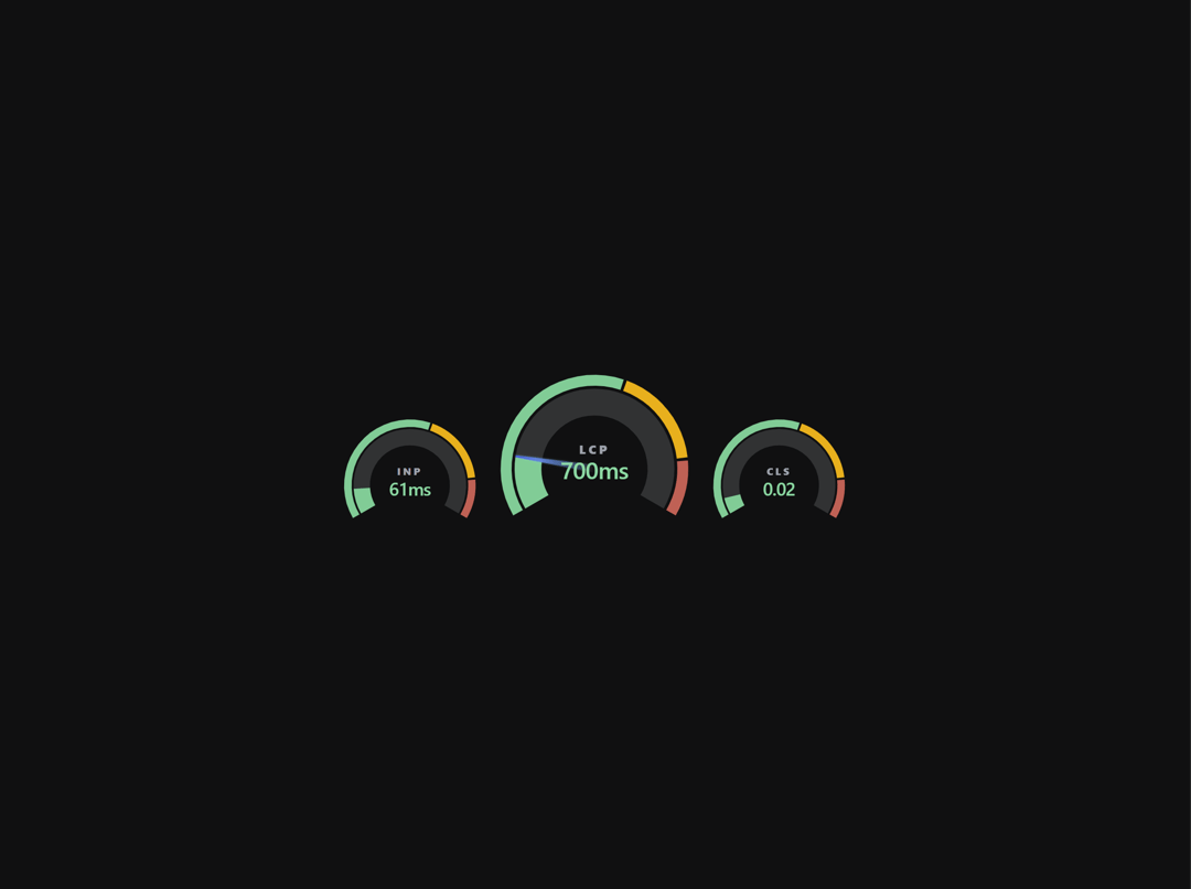
A customizable SVG gauge with segmented arcs, animated progress tracking, and an optional needle with gradient glow. Supports configurable segments, smooth CSS transitions, and reduced motion.
Built with React and Tailwind. Copy the prompt and paste it into Claude Code, Cursor or Lovable: your agent adds Gauge to your project and fits it to your theme.
Code
How Gauge is used: the demo's code. The component's own source comes with a free account.
Usage.tsx
'use client';

import { useState, useEffect } from 'react';
import Gauge, { type GaugeSegment, type GaugeSize } from '@/components/ui/gauge';
import { cn } from '@/lib/utils';

const SEGMENTS: GaugeSegment[] = [
  { percent: 58, color: 'var(--gauge-good)' },
  { percent: 27, color: 'var(--gauge-fair)' },
  { percent: 15, color: 'var(--gauge-poor)' },
];

const LABEL_COLORS = [
  { threshold: 58, color: 'var(--gauge-good-label)' },
  { threshold: 85, color: 'var(--gauge-fair-label)' },
  { threshold: 100, color: 'var(--gauge-poor-label)' },
];

function getLabelColor(progress: number): string {
  for (const { threshold, color } of LABEL_COLORS) {
    if (progress <= threshold) return color;
  }
  return LABEL_COLORS.at(-1)!.color;
}

const METRICS = {
  INP: [
    { progress: 31, value: '170ms' },
    { progress: 88, value: '480ms' },
    { progress: 11, value: '61ms' },
    { progress: 96, value: '522ms' },
  ],
  LCP: [
    { progress: 33, value: '1.4s' },
    { progress: 82, value: '3.6s' },
    { progress: 20, value: '850ms' },
    { progress: 97, value: '4.2s' },
  ],
  CLS: [
    { progress: 18, value: '0.05' },
    { progress: 81, value: '0.22' },
    { progress: 7, value: '0.02' },
    { progress: 96, value: '0.26' },
  ],
};

type MetricLabelProps = {
  name: string;
  value: string;
  progress: number;
  size?: GaugeSize;
};

function MetricLabel({ name, value, progress, size = 'md' }: MetricLabelProps) {
  const bottom = size === 'lg' ? 'bottom-[25%]' : 'bottom-[20%]';
  const nameSize = size === 'lg' ? 'text-xs' : 'text-[10px]';
  const valueSize = size === 'lg' ? 'text-2xl' : size === 'sm' ? 'text-sm' : 'text-lg';

  return (
    <div className={cn('pointer-events-none absolute right-0 left-0 flex flex-col items-center', bottom)}>
      <span className={cn('text-(--muted-foreground)/75 -mb-1 font-sans font-black tracking-[0.25em] uppercase', nameSize)}>
        {name}
      </span>
      <span
        className={cn('font-sans font-semibold tracking-tight tabular-nums drop-shadow-sm', valueSize)}
        style={{ color: getLabelColor(progress) }}
      >
        {value}
      </span>
    </div>
  );
}

export default function GaugeDemo() {
  const [tick, setTick] = useState(0);

  useEffect(() => {
    const id = setInterval(() => setTick((t) => (t + 1) % METRICS.LCP.length), 2500);
    return () => clearInterval(id);
  }, []);

  return (
    <div className="flex flex-col items-center">
      <div className="flex flex-wrap items-end justify-center gap-4">
        <Gauge variant="sm" segments={SEGMENTS} progress={METRICS.INP[tick].progress}>
          <MetricLabel name="INP" value={METRICS.INP[tick].value} progress={METRICS.INP[tick].progress} />
        </Gauge>

        <Gauge
          segments={SEGMENTS}
          progress={METRICS.LCP[tick].progress}
          needle={{ baseWidth: 6, tipWidth: 2 }}
        >
          <MetricLabel name="LCP" value={METRICS.LCP[tick].value} progress={METRICS.LCP[tick].progress} size="lg" />
        </Gauge>

        <Gauge variant="sm" segments={SEGMENTS} progress={METRICS.CLS[tick].progress}>
          <MetricLabel name="CLS" value={METRICS.CLS[tick].value} progress={METRICS.CLS[tick].progress} />
        </Gauge>
      </div>
    </div>
  );
}
More in Dashboards
View all
Dashboard with Collapsible Sidebar
2.5K

Sidebar
287

SaaS Template
2.5K
Stats Bento
1.1K

Chat template
614

System Status Block
316

Course Design Cards
1.1K
Rate Limit Meter
26


