
About
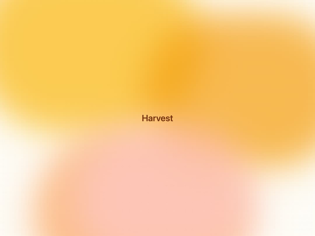
A warm, glowing gradient background wrapper with blurred amber and orange blobs plus a subtle dot-grid texture, used behind hero sections or content that needs a cozy honey-toned backdrop.
Built with React and Tailwind. Copy the prompt and paste it into Claude Code, Cursor or Lovable: your agent adds Honey Ember Background to your project and fits it to your theme.
Code
How Honey Ember Background is used: the demo's code. The component's own source comes with a free account.
Usage.tsx
import { HoneyEmberBackground } from "@/components/ui/honey-ember-background";

export default function HoneyEmberBackgroundDemo() {
  return (
    <HoneyEmberBackground className="min-h-screen w-full flex items-center justify-center p-8">
      <h1 className="text-4xl font-semibold text-[#78350F]">Harvest</h1>
    </HoneyEmberBackground>
  );
}
More by bidyut10
View all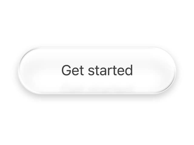
Sheen Pill Button
47
Booking Slot Calendar
32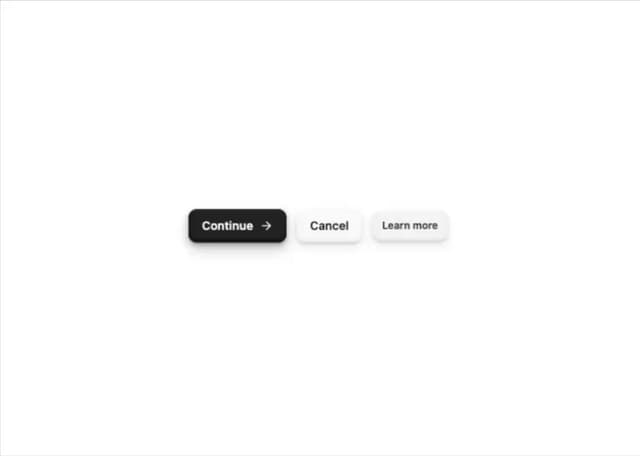
Tactile 3D Button
13
Add to Cart Button
13
Download Button
7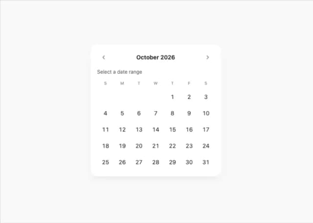
Date Range Picker Card
3
More in Heroes
View all

SaaS Template
2.5K

Hero
1.3K

Responsive Hero Banner
2K
Centered Hero with Image Fan
968
Editorial Collage Hero
458

Minimalist Hero Fashion
296
Glass Fold
279

Aero Hero-3
576
